As the amount of people in the World continues to grow, so the does the amount of people accessing the internet each day. We, as a world, are more closely connected to each other and other countries as we ever have been. It very interesting to watch our digital futures unfold and based on statistics from multiple sources we can gain a pretty clear perspective of who is using the internet and what they’re doing when they use the internet.
I was surfing the web the other day and I stumbled upon 4 very interesting infographics related to internet use. The infographics were originally posted on SmashingApps.com and give us a very good perspective on how many people are using the internet, what they’re doing when they use the interent and just how massive the internet actually is.
The first infographic is rather general but presents us with some very interesting information. It tells us which countries have the most internet users, what percentage of the total population of those countries is using the internet, how much time is spent on Facebook and other interesting statistics on how users spend their time on the internet.

The second infographic shows us the sheer number of internet users and how much data, in terms of terabytes, is actually accessible on the internet. It also concentrates on exactly how many people are using social networking sites such as Facebook, Twitter and Youtube.

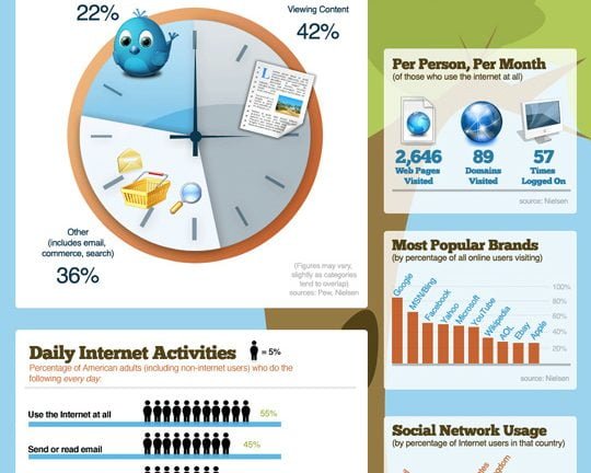
The third infographic presents us with a slew of statistics exploring what users do in their time on the internet. This graphic breaks internet use into percentages and really shows us how much time is spent using social networking services. Over 1/5 of all the time people spend on the internet is spent using social networking sites! The third infographic also breaks internet use into daily activities and really gives a closer view at what people are actually doing with their time online.
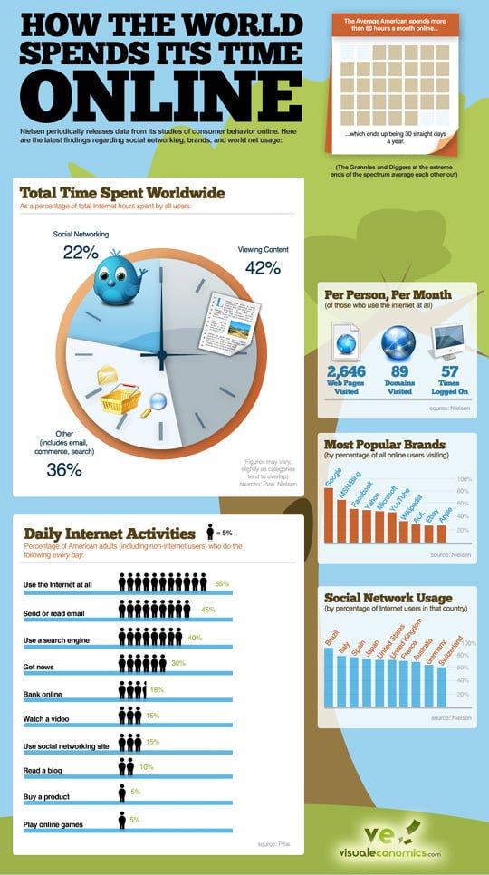
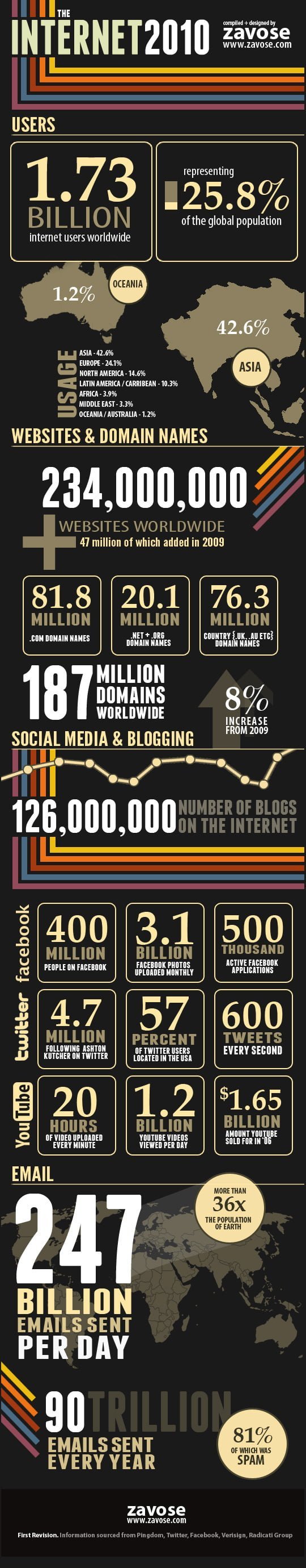
The fourth, and final infographic presents specific information on internet use in 2010. This image concentrates heavily on social media usage and presents information not only on how much time people spend using social media, but also the specific activities people are doing within social media services.
Based on these 4 infographics we can see that internet usage is unbelievable prevalent in today’s World, especially the use of social media. I expect all of the statistics related to social media to increase in coming years. Our online experience will eventually be completely guided through the use of social media and it will be increasingly hard to separate general online usage statistics from social media usage statistics. These two methods of interent use will eventually become one in the same and our online experience will revolve around our social networks, our online tendencies and the online tendencies of our friends and people we trust.
To read more about the direction that I believe the internet and social media are heading towards check out my article, “The Future of Information Sharing Through Social Media and Why Everyone Benefits“.
More infographics on online trends you may want to check out: