Update: Although this infographic does a good job of covering the features of Google+ and Facebook, if you would like to see more information about user statistics in Google+ compared to Facebook, check out my other Google+ infographic!
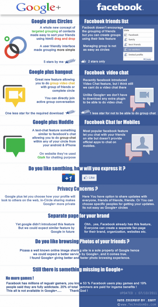
Google+ has been out for over a week now and I’ve finally found the first infographic related to the new social sharing platform. This infographic was originally posted by TechnoBombs.com and gives a great comparison of Google+ and Facebook.
The grammer and spelling were rather rushed so I did my best to correct them in photoshop but there were a few awkward sentences that I couldn’t hide! Other than that it is a good read!
Google has never actually called Google Plus a “social media” platform and, instead, insists on using the term “social sharing“. Regardless of how Google describes their innovative approach to social interaction and information sharing, it is no secret that it has created competition for Facebook.
If you’ve been following my blog then you know that I’m already a fan of Google+ but if you’re still on the fence, this infographic may help you pick a side!
Don’t forget to check out the Complete Google+ Setup Guide!


