
Most of the internet you use every day travels through undersea fiber-optic cables. Not satellites. Not “the cloud.” Physical glass cables on the ocean floor carry the bulk of intercontinental traffic—which is why chokepoints and cable cuts can slow (or sometimes partially disrupt) entire regions.
This page is designed to answer a simple question: what does the world internet cable map actually look like, and how do those connections work in real life?
Quick Start
- Map 1 is the modern world internet cable map (today’s backbone).
- Map 2 highlights a major internet cable chokepoint in the Red Sea.
- Map 3 shows how dramatically Africa’s internet cable network has expanded.
- Map 4 is the original early-2010s map kept as a historical comparison.
Tip: Click any map to open it full screen.
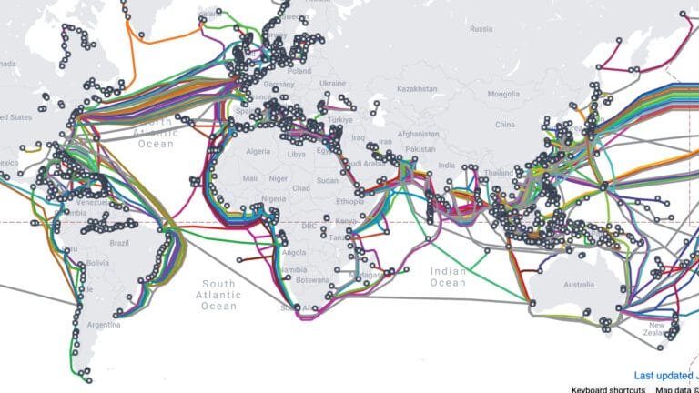
Map 1: World internet cable map (modern global view)
This is the modern view most people are looking for: a high-resolution world internet cable map showing how continents are connected by undersea fiber. Two things should stand out immediately:
- Landing points cluster around major coastal hubs and dense population centers.
- The world is stitched together by many parallel routes, not one “main line.”

Full-screen viewing + download
Full screen: click any map to open it in a new tab.
Download: once the image opens full screen, use your browser’s download option (or right-click > Save Image As). This gives you the cleanest, highest-resolution copy available on the page.
Authoritative sources (interactive + official)
Want to verify the data or go deeper?
- TeleGeography Submarine Cable Map (interactive): submarinecablemap.com
- ITU Global Connectivity Report (submarine cable stats + context): ITU report hub
- FCC submarine cable landing licenses (U.S. regulatory view): FCC guide
- Internet Society policy brief (resilience + risk framing): Internet Society
These are high-authority references that match what you’re seeing on the maps and can be quite fun to explore.
How undersea internet cables work (plain language)
Undersea internet cables are fiber-optic lines laid on (or slightly under) the ocean floor. Data travels as light through glass strands, and repeaters boost the signal across long distances.
Example
A typical cross-continent request often looks like this:
Your device → local ISP → regional backbone → coastal landing station
→ undersea cable → landing station → backbone → data center/cloud → website/app
Satellites matter for remote access and backup in some scenarios, but for high-volume intercontinental traffic, fiber is still the main highway.
One subtle but important detail: “the internet” isn’t one network. It’s thousands of networks that interconnect. The cables provide the physical paths, and routing determines which path traffic uses at any moment.
Map 2: Red Sea internet cable chokepoint
Some regions are more fragile than others—not because they have “less internet,” but because a lot of global traffic is concentrated through narrow corridors. One of the most discussed examples is the Red Sea area, where many cables pass through relatively constrained waters.

Important
Chokepoint risk does not mean “instant blackout.” The more common outcome is congestion and slowdowns as traffic reroutes onto fewer remaining paths.
Map 3: Africa internet cable map (connectivity expansion)
In the early 2010s, it was easy to talk about Africa as if it relied on only a small number of major pipelines. That’s no longer an accurate way to describe the continent’s connectivity.
Africa has experienced one of the most dramatic undersea cable expansions in the world. More systems and more landings generally means more capacity and better rerouting options when something fails.

Tip
- More landings = fewer single points of failure
- More routes = better rerouting during outages
- More capacity = better performance during peak traffic
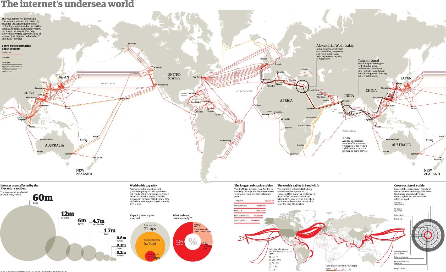
Map 4: The original early-2010s map (historical reference)
The map below is the one that started this post years ago. I first saw it in an undergraduate international information systems class, and it was one of the first visuals that made the physical internet feel “real.” I’m keeping it here as a historical snapshot and an easy comparison against modern maps.
What happens when a cable is cut?
Undersea cables fail more often than most people realize. The most common causes are mundane: anchors, fishing activity, and accidents. The outcomes usually fall into one of these buckets:
- Rerouting with minimal impact (best case)
- Slower speeds / higher latency due to congestion on alternate paths
- Regional degradation if a country or island relies heavily on limited landings
- Partial outages for specific networks or services (not always “the whole internet”)
How to think about it
A cut cable is like losing lanes on a highway. Traffic may still flow, but bottlenecks can appear quickly—especially in high-demand corridors.
Frequently Asked Questions
Yes. Satellites are important for specific scenarios, but undersea fiber remains the primary way high-volume data moves between continents.
Landing sites are chosen based on geography, seabed conditions, permitting, infrastructure, and proximity to major networks and data centers.
Sometimes, but it depends on redundancy. Countries and islands with few landings are more vulnerable. Regions with multiple landings and diverse routes usually reroute traffic instead.
No. Satellites can supplement and back up connectivity, but they don’t replace fiber’s capacity and consistency for global-scale traffic.