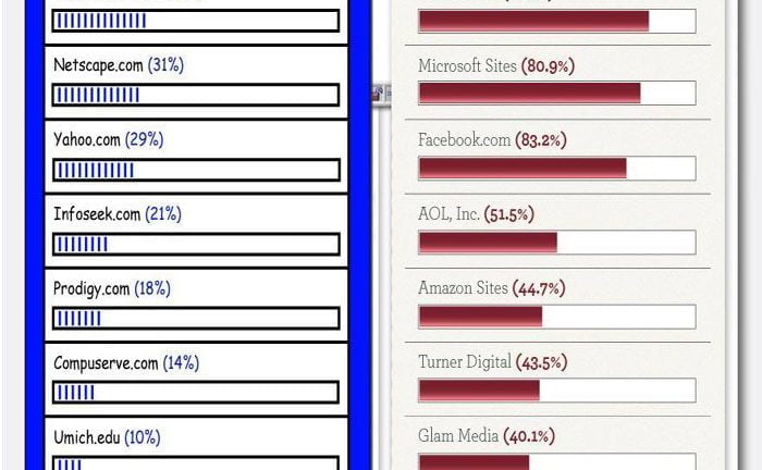
Many people take the internet for granted nowadays. The best way to realize just how far it has come since it beginning is to graphically and statistically compare the interent of today to the internet of the 1990’s.
I was sent an awesome infographic (posted below) from OnlineUniversity.net that makes a great comparison between the World Wide Web of the 1900’s and our modern internet.
The greatest part about this infographic is that it visually compares the look and feel of the internet in 1996 to the look and feel of the internet today, in 2011.
The infographic even puts certain websites that exist today and existed in 1996 side-by-side so we can see how they’ve evolved over the years. Some of the websites compared below are GoDaddy, Mapquest and Travelocity.
There is also some very useful statistical information provided by the infographic:
- In 1996 there were 20 million internet users in the United States. Now, in 2011, there are 245 million internet users.
- In 1996 Americans averaged 30 minutes of internet usage time per person a month. In 2011, Americans spend an average of 27 hours online per month.
- In 1996 the average page took 30 seconds to fully load. In 2011, the average page takes 6 seconds to load.
If you enjoy the infographic below then you will most definitely enjoy my infographic on What Happens on the Internet in 1 Minute.


