
As social media continues to grow, marketers, bloggers and businesses are experimenting with different ways to leverage their marketing efforts through the use social media buttons and profiles.
There is no doubt that providing an easy mechanism for users, customers and readers to share your content can definitely increase the exposure of your blog or website.
Knowing some social media button do’s and don’ts will increase your chances of being successful. Consider the following strategies before you decide on a plan of action for your blog or website.
Top 5 Placement Strategies for Social Networking Buttons:
1. Use Recognizable Button Icons
Make sure that the buttons and icons you use to represent the different social networks are recognizable. If you’re just starting out, it’s probably best to use the official share buttons provided by each particular social network such as the official Facebook buttons and the official Twitter buttons.
These buttons will be easily identified by your readers – make them more likely to share your content.
Using custom social sharing buttons can work if done correctly. It’s important to make sure that the buttons you create are recognizable by viewers.
For example, you could unify the colors of your buttons but retain the each network’s logo, as is done on the WordStream blog:
Custom share buttons can help give your site a more professional feel if done correctly.
It becomes a balancing act between customization and recognizability.
2. Place Social Buttons Near Body of Content
This strategy may seem obvious but, if overlooked, can really hamper the success of your social sharing campaign. Make sure that your social buttons are close to the main body of your content. Placing social buttons in the dark corners of your blog is not going to produce the results you’re looking for.
One way to accomplish this, is to use a fixed header or floating bar. These elements will continue to stay fixed as the user scrolls down the page – making it so social sharing options are always visible to the user.
There are advantages and disadvantages to using this strategy. If done, tastefully, it can be a very nice feature of your site.
On the other hand, these can elements can slow down page load time and can appear intrusive to the user in some situations. Don’t make the share buttons too big when using this strategy or they may distract from your content. It’s also a good idea to make sure the different buttons are uniform in size and shape when utilizing this method – it will look much cleaner to your readers.
It’s best to keep your fixed headers simple by using CSS – instead of using a plugin or javascript.
If you’re not ready to use a fixed header or floating bar, your best bet is probably to place your social sharing buttons at the top of your content. This ensures the reader won’t miss them – even if they don’t reach it all the way to the bottom of the page.
If a user decides to actively share your content, they will most likely look at both the top and bottom of your page for sharing options before giving up.
That being said, placing sharing buttons at the bottom of your page isn’t a bad idea – you’re just risking that the user never sees them.
You also may want to think about placing buttons both at the top and at the bottom of your content. This will make it so your sharing buttons are visible on the page and easy to find.
You should take caution when doing this, however, because if they are too large / prominent, the user may find them distracting. It also may appear that you are desperate for social shares – not something you want your users to be thinking.
To be safe, social buttons at the top of your content is probably the way to go until you develop a nice fixed header or floating bar for your site.
3. Highlight Content That Other People Also Like
The more Facebook “likes” or “tweets” your articles receive, the more likely that other readers will deem your content share-worthy as well.
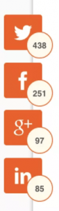
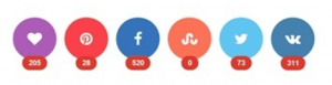
Knowing this, it may seem like a good idea to display counters next to your sharing buttons so new readers can see how many times your content has been shared in the past.
This strategy can work but, it’s also important to remember that some users may make a judgement on the quality of an article before actually reading it based solely on the number of Facebook “likes” it has received. If your blog is new and your content isn’t being shared much yet, it is probably best to hide the counters until you’ve gained better social traction.
One way to solve this issue, is to only show share counters after a post has received a minimum number of shares. For example, the share counter won’t show up until the post has 50 Facebook likes / shares.
There are a number of plugins that can help you with implementing this depending on what content management system you’re using.
4. Prioritize Social Networks
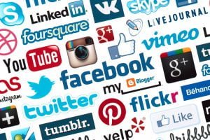
It may be tempting to load your articles with sharing buttons to as many social websites as possible. This, however, can be overwhelming and confusing to the user.
It’s best to pick 4-5 prominent networks that your users will most likely associate with. There are some obvious ones to have displayed – Facebook, Twitter, Google+ and LinkedIn.
Beyond those 4, you may want to consider adding an email share button, Reddit, StumbleUpon or other network that is related to your blog or website.
Some plugins, such as Share by Sumo, will automatically show your share buttons in order of which network your content has already been most shared on. This is a good way to highlight how much users are sharing your content but does make your site a bit more inconsistent if users are going to be viewing multiple pages.
5. Keep it Clean and Simple
There are a lot of options when it comes to placing social share buttons on your blog or website.
It can be easy to overdo it causing your page load speed to decrease and your users to become frustrated and confused.
Remember, you want your users to be aware of the sharing buttons on your website but you still want your content to the be main focus.
Social sharing plugins may seem like a great idea but they are a common cause of page load time issues. Designing your own social sharing buttons using simple CSS is probably the way to go to keep your page load time low.
If you’re going to use a floating bar or fixed header, make sure to do plenty of testing to make sure it isn’t intrusive to the user’s experience.
If you decide to go with a plugin, it’s best to use a plugin that is tried and true. Most premium plugins also offer a trial period so make sure you take advantage and do plenty of testing during that time.
Hopefully these social media button strategies will help you increase the exposure of your online venture. If you’re looking for more tips on improving your website, take a look at my article, “Blogging Advice for New Bloggers.
This article was originally published in 2012 but was completely revamped in 2017 to be as relevant as possible.