How effective are infographics at driving traffic to my site?
A lot of online publishers have been asking themselves this question lately. If you’ve been browsing the web recently, then you’ve probably seen at least one interesting infographic containing statistical information about a specific topic.
The infographic trend seems to be making a big impact on digital publishing as they are fun to read, easy to share and contain interesting information.
See Also: Internet Addiction Statistics 2012 [Infographic]
There are a couple of drawbacks to infographics, specifically the fact that the information within an infographic is not indexed by Google because it is simple an image instead of indexable text.
There are, however, many techniques on optimizing an infographic for SEO that you see me use on AnsonAlex.com on a regular basis.
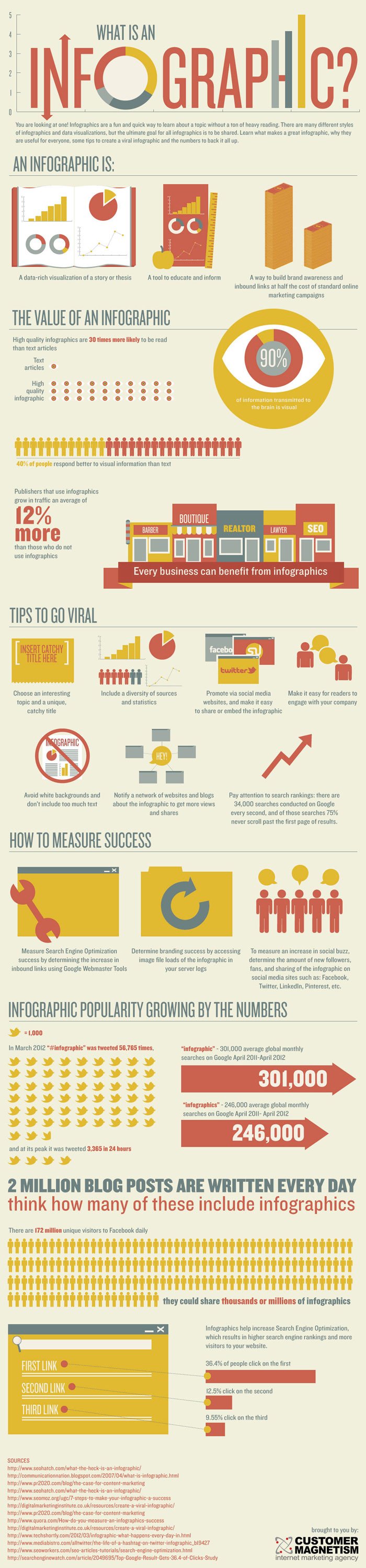
An infographic (posted below) was recently published by CustomerMagnetism.com that, ironically, provides us with some information regarding the effectiveness of infographics in regards to traffic generation.
Infographic Effectiveness Statistics Highlights:
- High quality infographics are 30 times more likely to be read than text articles.
- Publishers that feature infographics grow traffic 12% faster than publishers that don’t feature infographics.
- The words “infographic” and “infographics” are searched an average of 547,000 times per month in Google.